OUT-OF-THE-BOX CRM
Salesforce IQ Contact Gallery
SalesforceIQ gives you the simplicity of a spreadsheet with the horsepower of a full-featured CRM. With Automatic Data Capture and enterprise-level intelligence under the hood, SalesforceIQ acts like your own personal assistant so you can focus on what matters most: selling. SalesforceIQ, formerly RelateIQ focuses on creating an easy to use out of the box CRM solution that is super flexible. Our customers span from small 1 seat orgs to large companies like Uber.
BACKGROUND
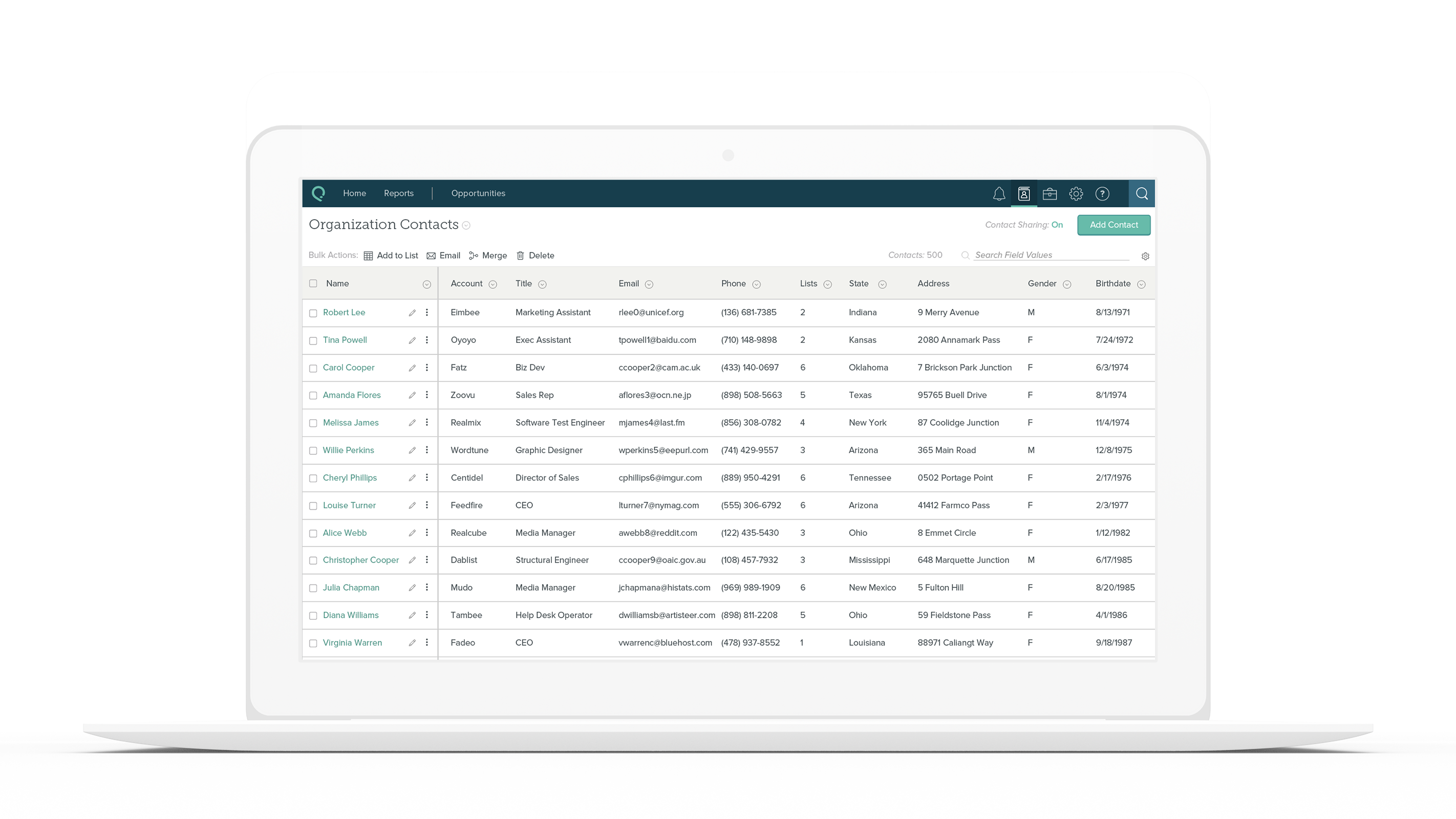
SalesforceIQ introduced Automatic Data Capture, which connected our CRM with a user's email. To support the initial release, a contact gallery was created to dump all new contacts. As the CRM grew, users expressed the desire to have a more powerful contact-based workflow. As a Sr. Designer, I was tasked with exploring this feature gap and crafting a solution in the form of a new Contact Gallery.
Pillars of the SalesforceIQ CRM
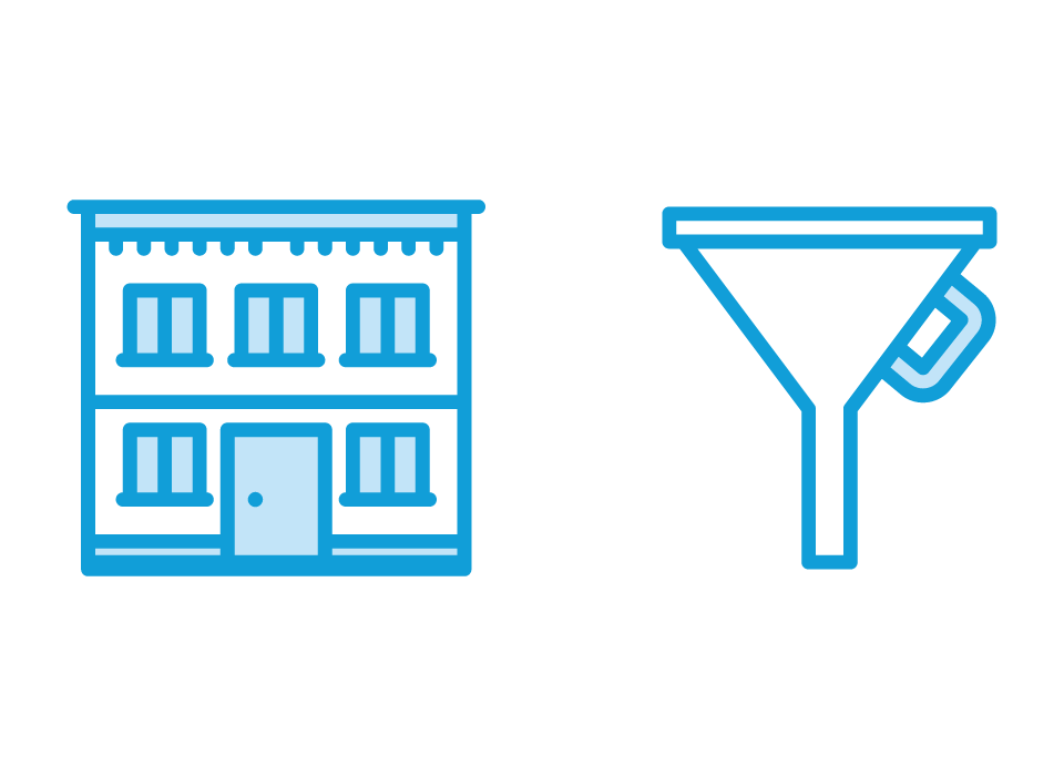
At SalesforceIQ, our product had two major workflows. An accounts based workflow that dealt with b2b operations, in that one account had multiple individuals associated with it. The other workflow was a Leads based workflow that dealt with working with a single individual.
Account-based workflows revolve around the business to business deals.
Lead-based workflows revolve around sourcing and closing individuals within a company.

Creating a Contact Workflow
We knew that with the power of our industry-first Automatic Data Capture solution, people also wanted to manage their contact based workflows, which were more 1:1 in nature. We knew this because a vast majority of our customers created Lists with the name “Contacts”.
Contact based workflows revolve around managing individual contacts.
DEFINITIONS
Problem Statment
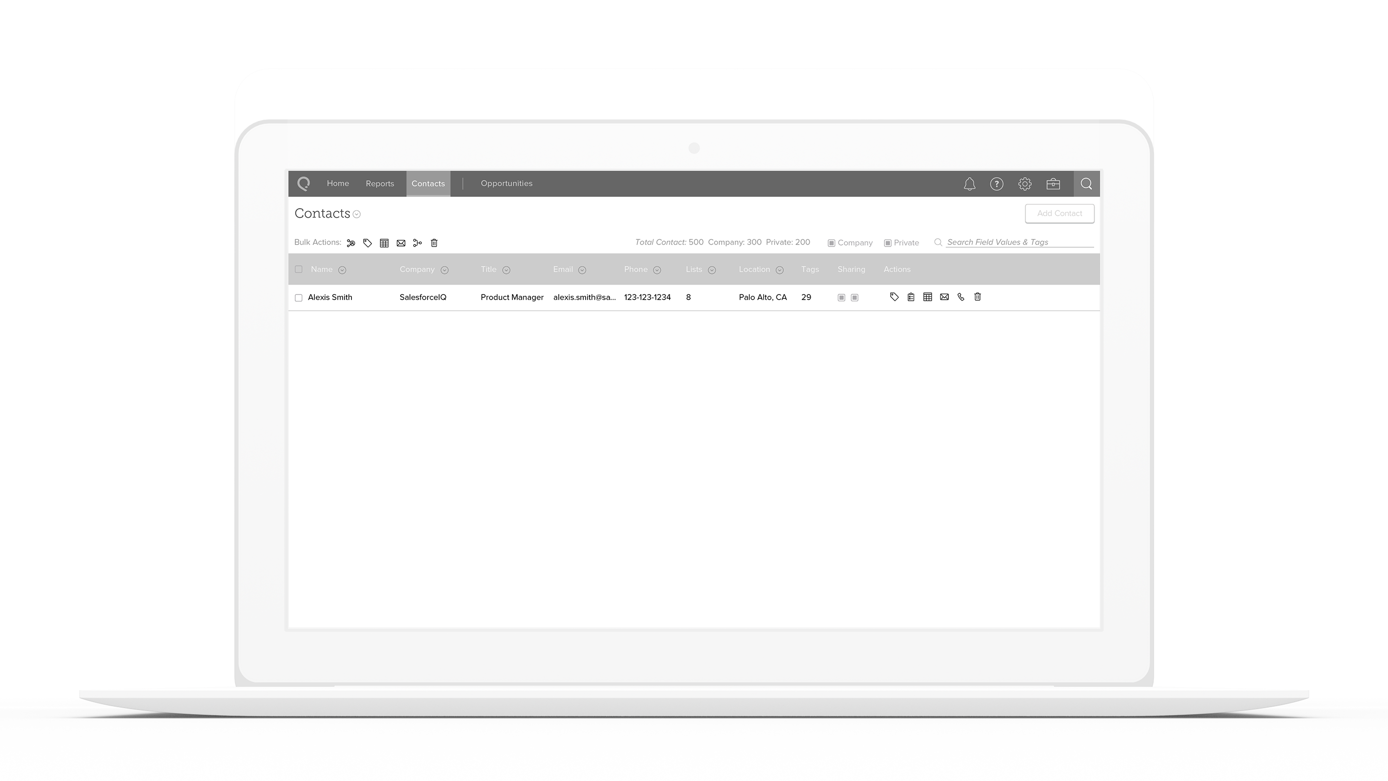
The SalesforceIQ Contact Gallery provides minimal value to users because the records are not organized in an efficient or intuitive way that provides incremental value beyond what they can accomplish in the Grid.
Objective
To redesign contact and account gallery within SalesforceIQ in a way that is visually intuitive and efficient for users that provides incremental value beyond what they can accomplish in the Grid.
Hypothesis
Redesigning the SalesforceIQ Contact Gallery as an intuitive, customizable, quickly actionable table will make it an essential tool for users to manage contact-based workflows incremental to what they can accomplish in the Grid.
PROCESS
Research
My first step in any project is doing market research to ensure I understand the issues, feature gaps, and general market landscape from both a design and a business perspective. To redesign our contact gallery, I looked to Contact Management systems, phones, and social media platforms as inspiration.
After understanding where the gap in our product was, I drafted a set of questions and proceeded to set up group interview sessions with our AE’s and CS team to gain further insight into the gaps that our users feel. Our AE’s helped me craft a narrative around the product, and the CS team showed me hacks they and our customers had created to fill the current gaps.
After gaining a solid understanding, my PM and I organized customer calls to validate our understanding, and most importantly understand how our product was working in the real world.

Market Research
Design Patterns, Competitive Analysis, Adjacent Industries, Best Practices

Account Exec Interviews
Understanding pain points in selling the product and overall narrative.

C.S. Interviews
Understand friction points for existing users and new users. Get a sense of features that would add value.

Customer Interviews
Understand the user needs and their workflows. Validate and expand upon existing data and research.
Project Principles
I believe principles help keep you grounded while giving you the flexibility to react to new information. One can always reevaluate principles, and the act of doing so helps serve their purpose, which is to ensure we do right by the customers. I like to craft the principles after speaking to the stakeholders and customers to ensure they do them justice.

Discoverable

Actionable

Intuitive
Defining the Feature Set
This was a massive project that spanned several months. Most of the features scoped either didn't exist or needed to be repurposed from other parts of the product. To maintain speed, the project was divided into smaller chunks with several epics.
Add Contacts
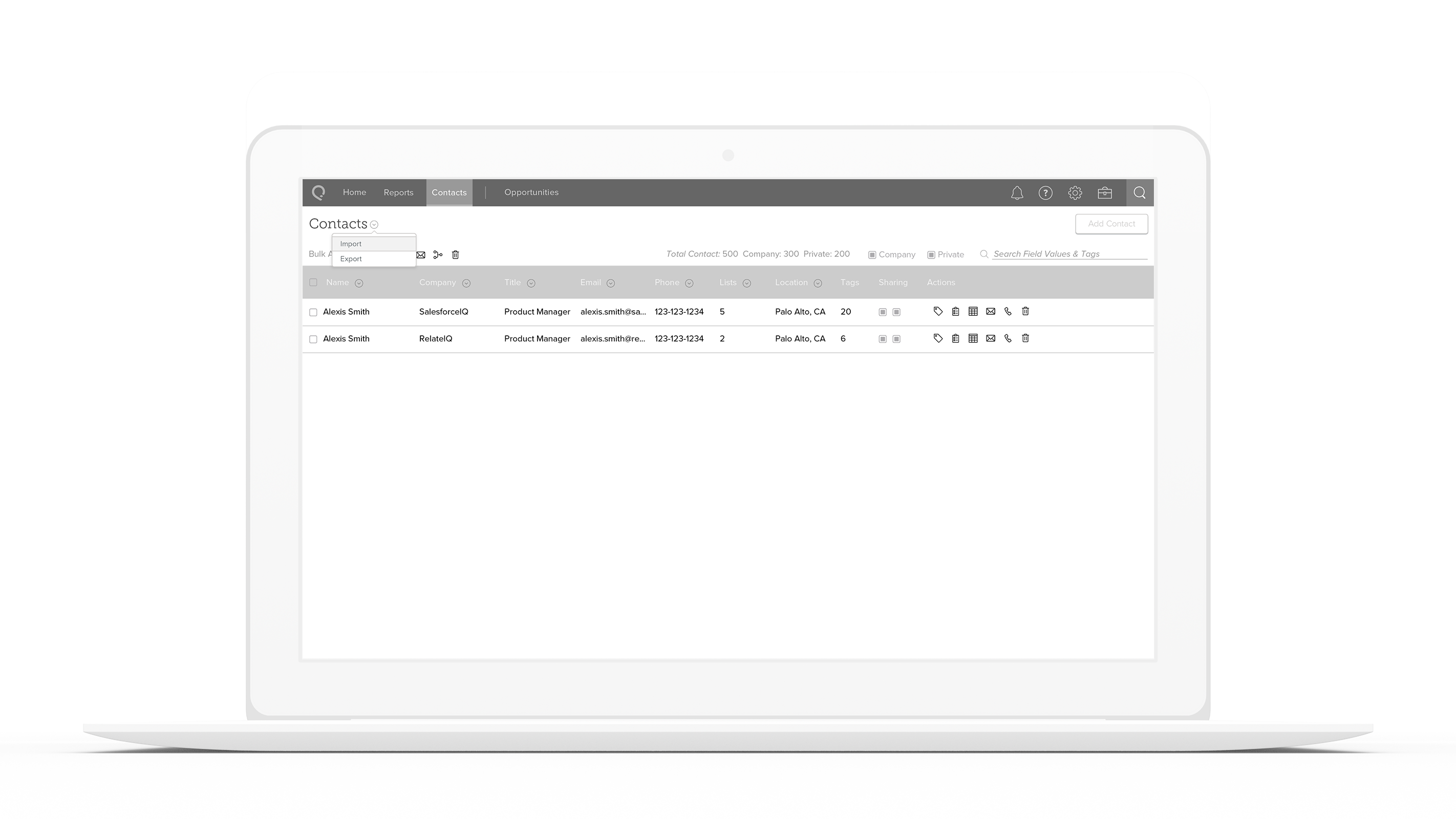
Import Contacts
Share Contacts
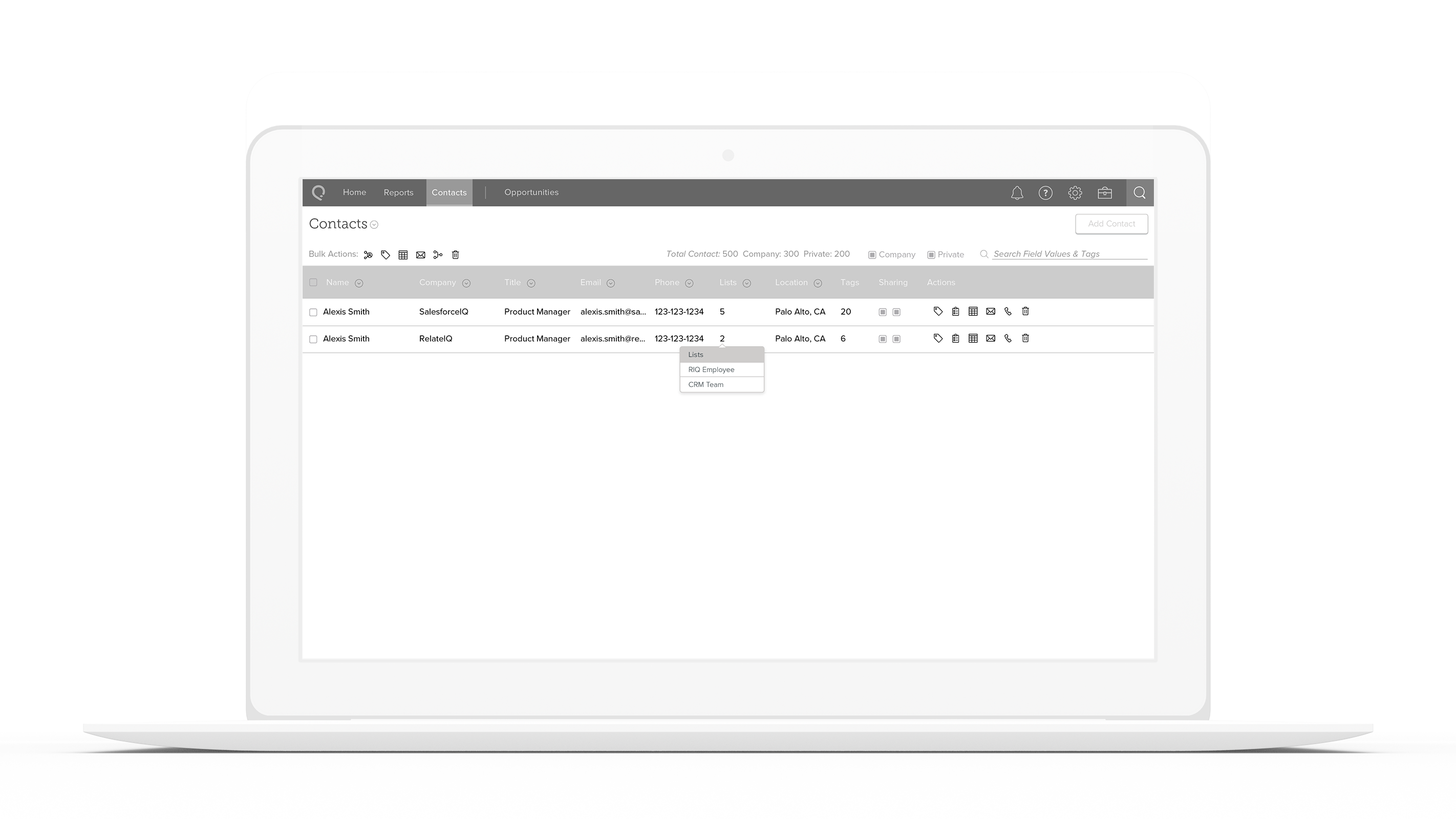
Add Contacts to Lists
Email Contacts
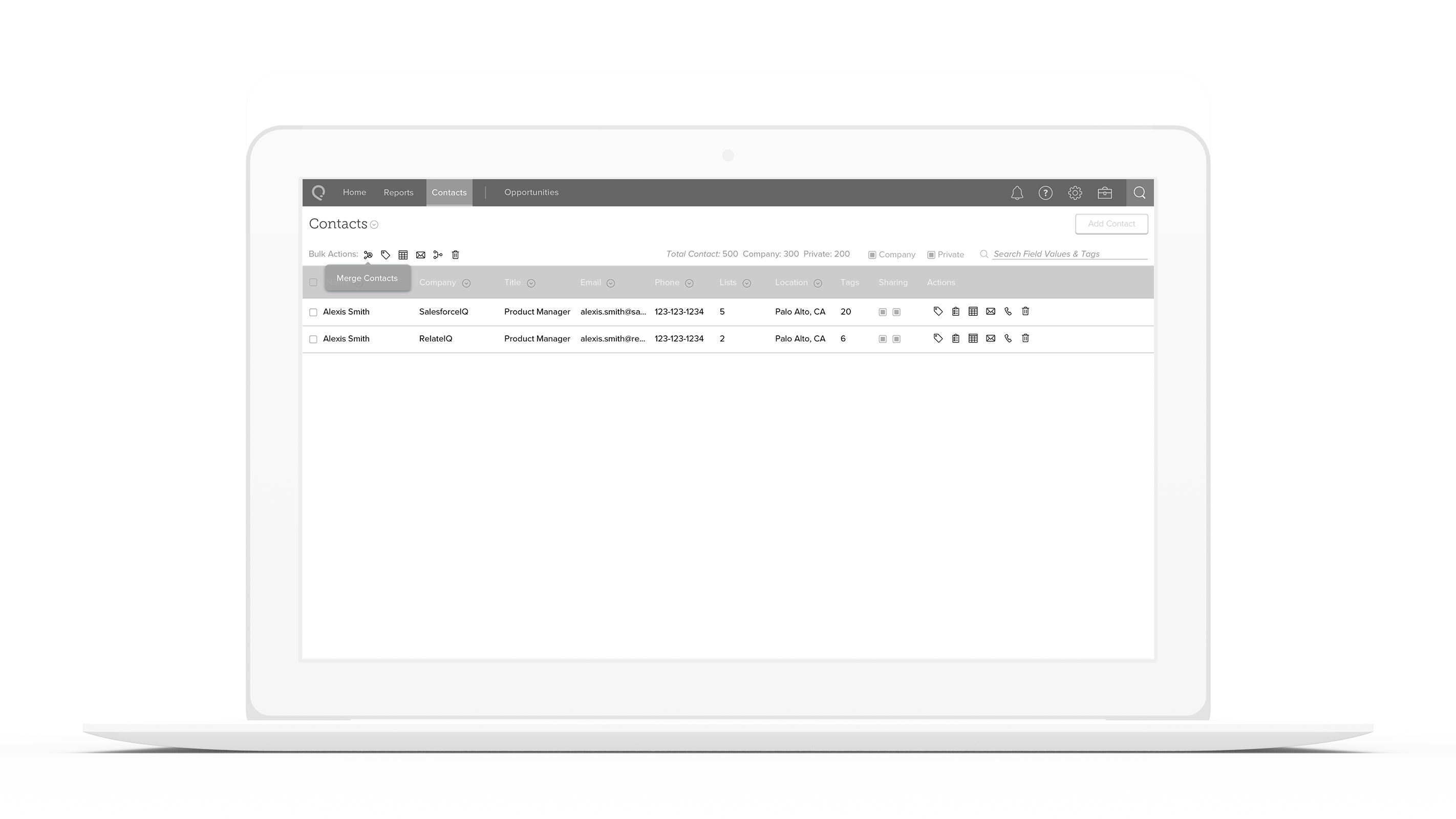
Merge Contacts
Archive and restore Contacts
Assign a task to a Contact
Call a Contact
Add custom Contact properties
Inspiration Board
After defining the desired features and principles, you can start looking for inspiration from not just competitors, but also adjacent industries. After examining competitors, it was apparent that typical CRM's don't focus on the feature area scoped. Looking to adjacent industries as well as consumer products provided insight into how customers might normally stitch together a contact-based workflow, and what they might expect.
DESIGN
Wireframes
As this was a large project, I wanted to first capture the high-level objectives to be able to provide my engineering counterparts with material to estimate cost from. My initial wireframes outlined the overall system we wanted to develop while highlighting some key moments of complexity. The three goals for wireframes are to verify the UX fulfills all product requirements, engineering has all the data for scaffolding and architecture, and Design has a good understanding of what information architecture will work best. Taking wireframes to customers for testing helps ensure that the three objectives are met in a way that will yield the best results.
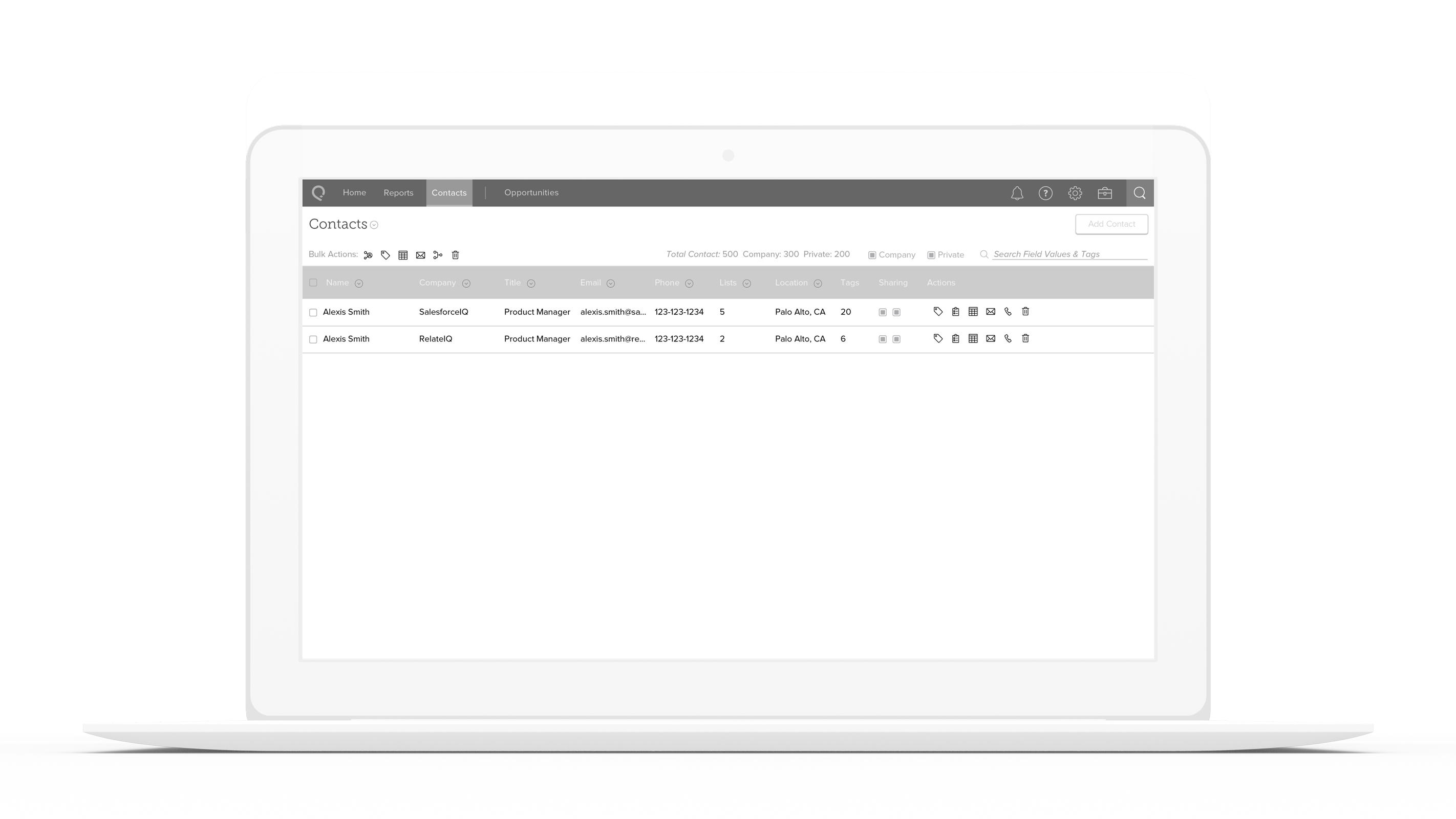
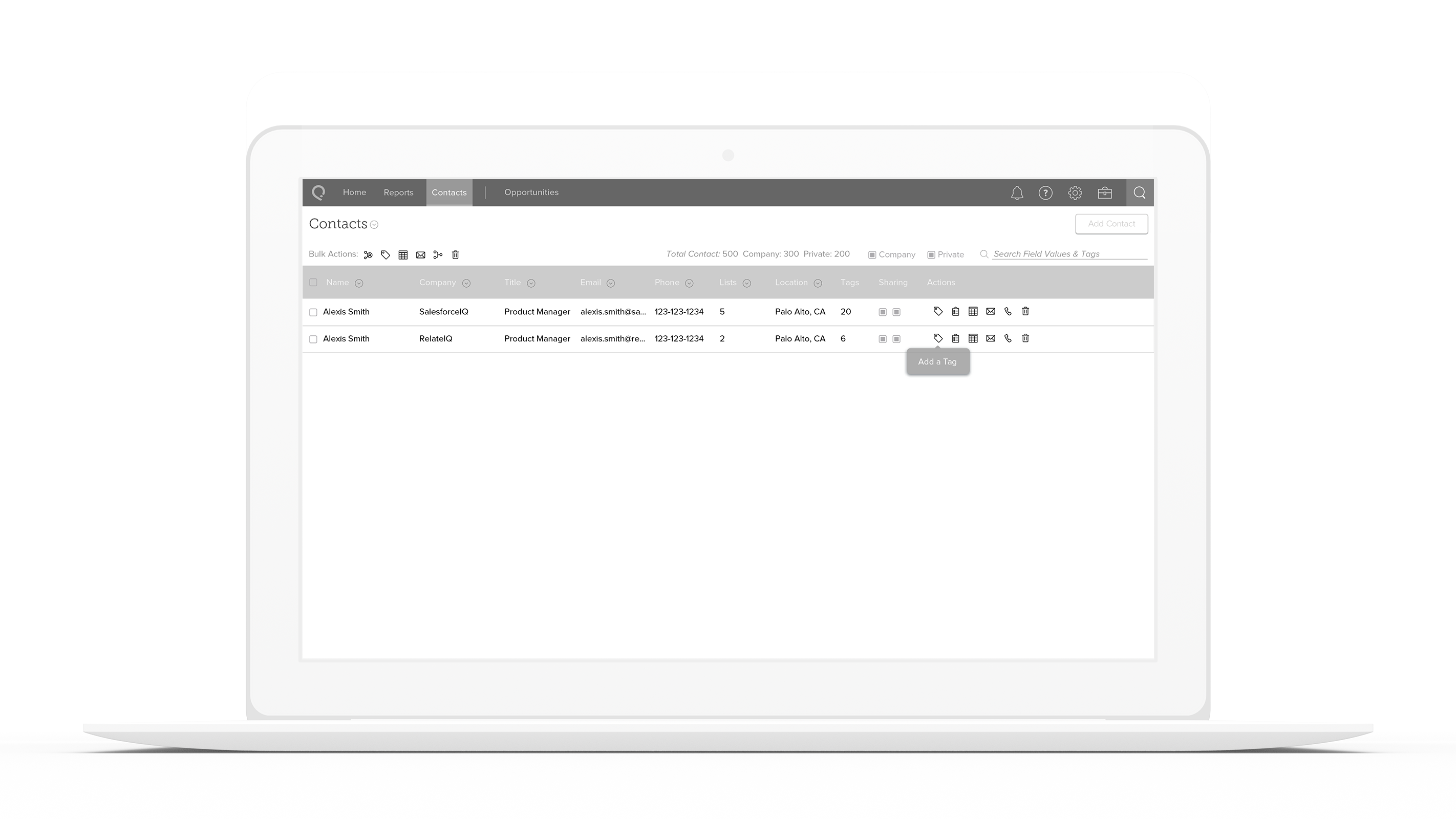
Hover to reveal more information.
I wanted to make sure that we created something that was powerful but still adheres to our principle of Discoverable, which to me meant that this product needed to be easy to parse.
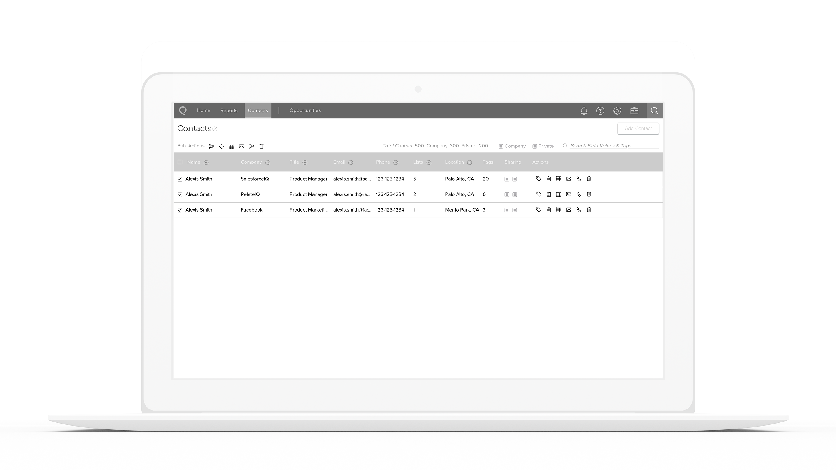
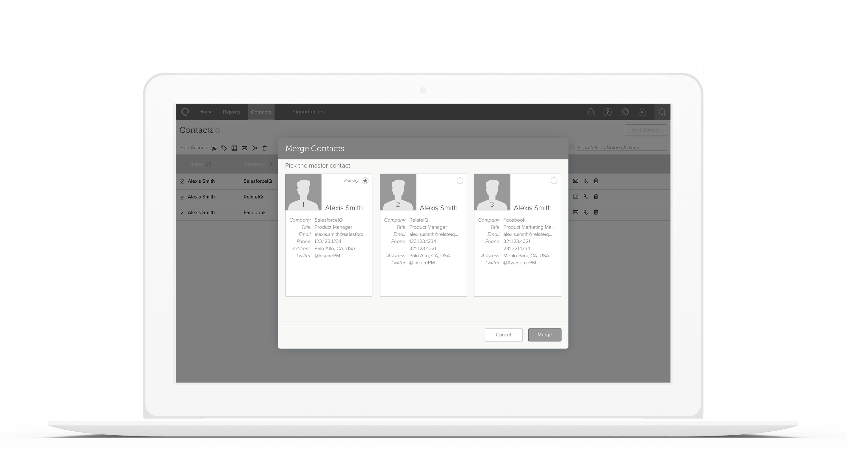
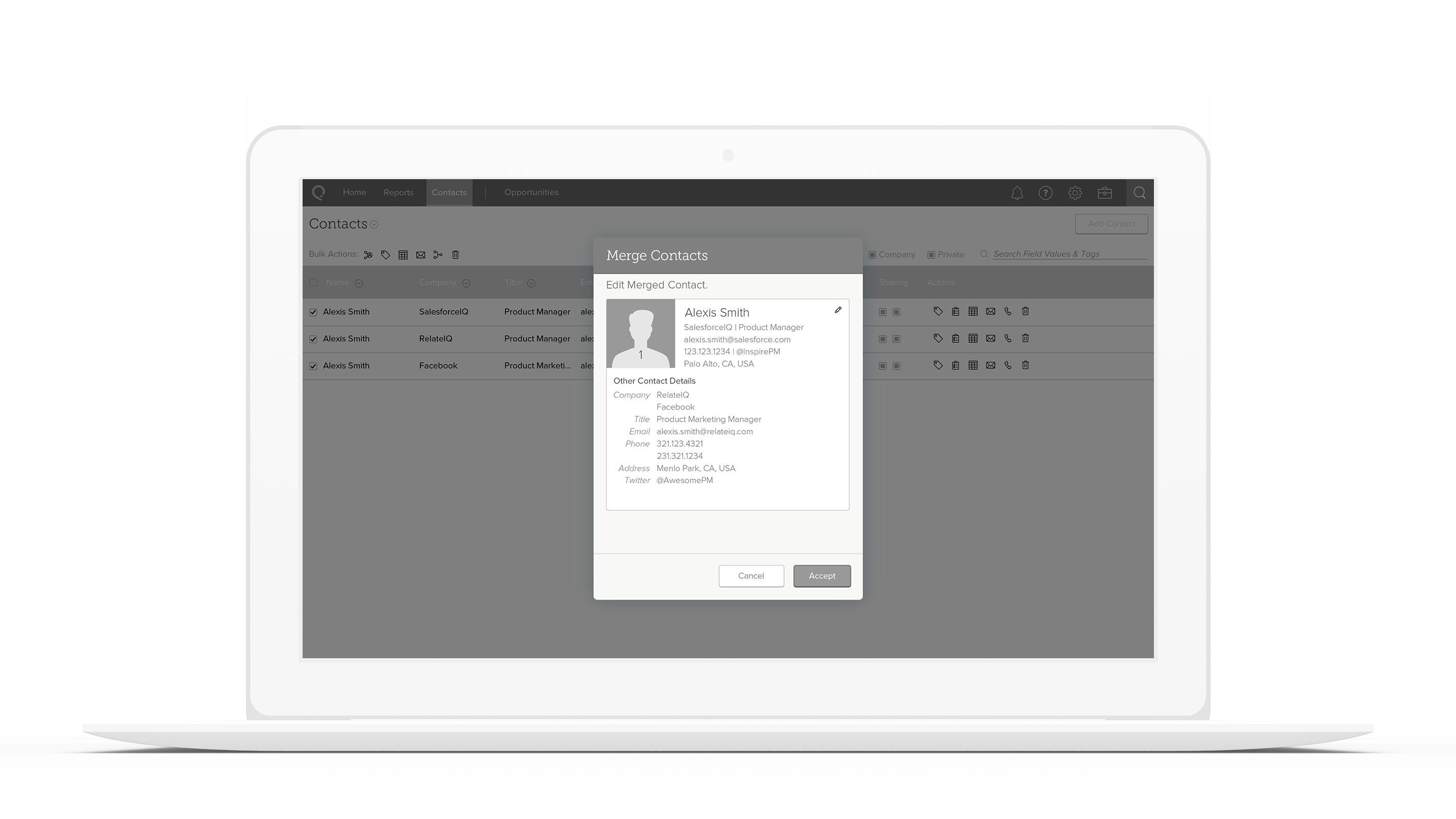
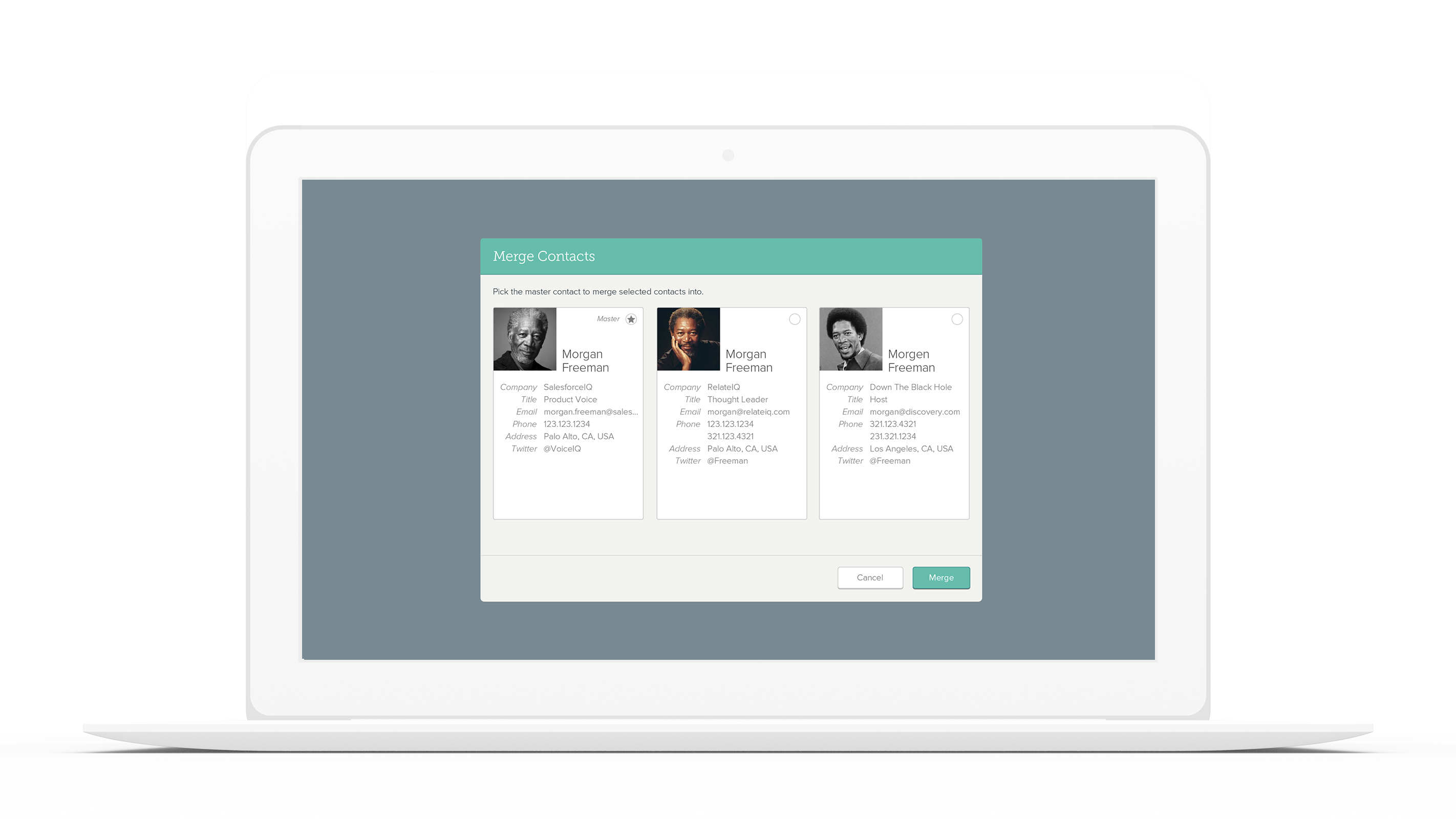
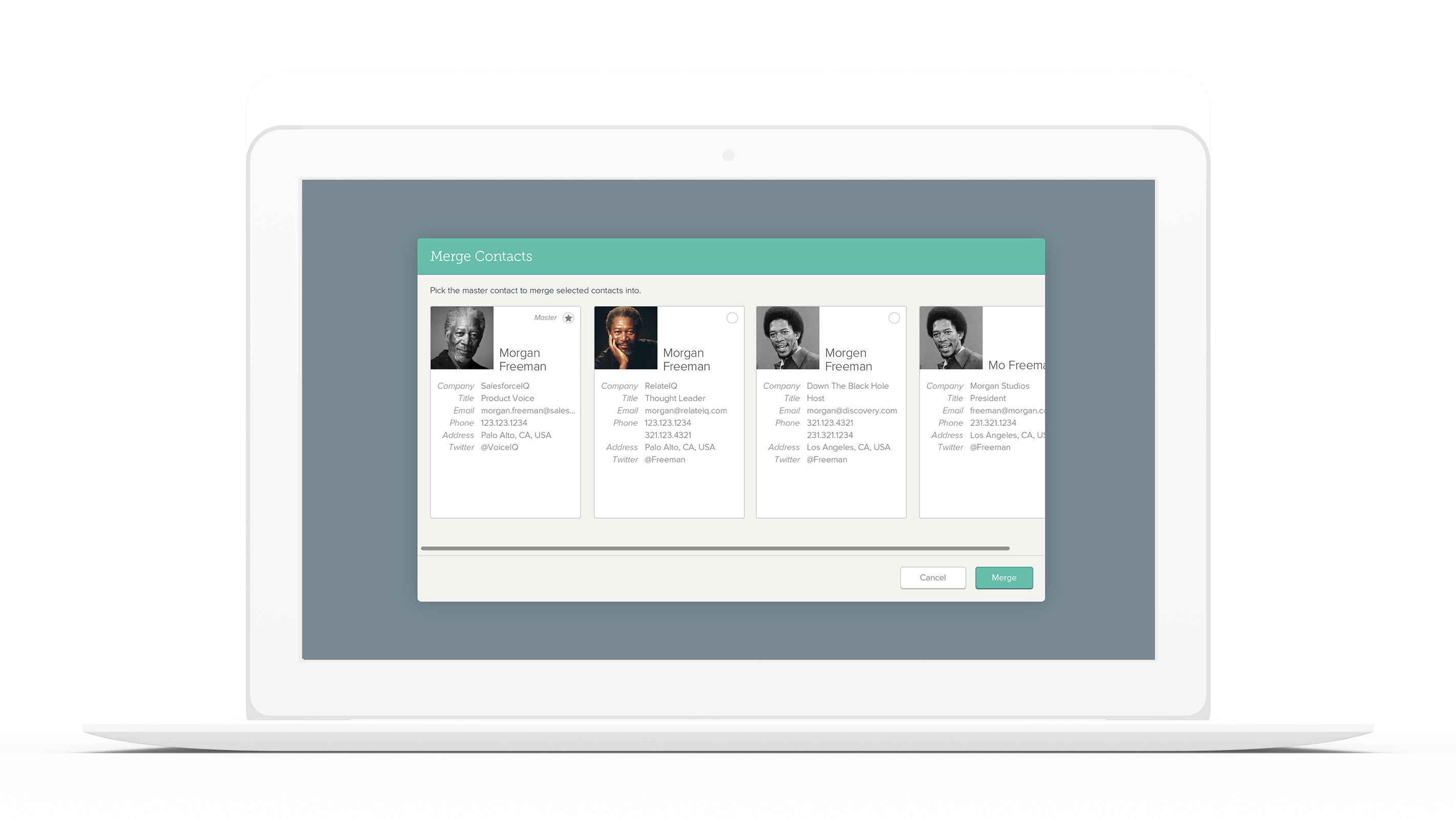
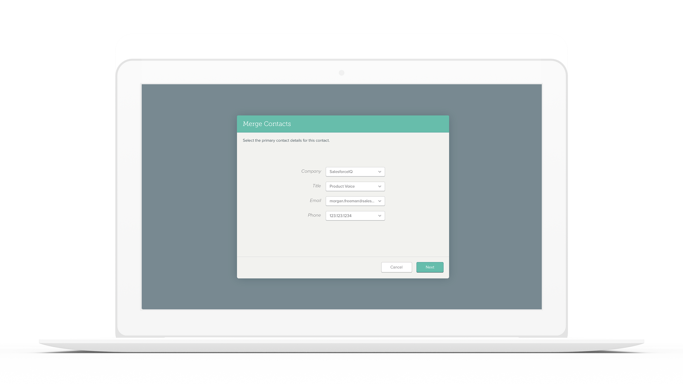
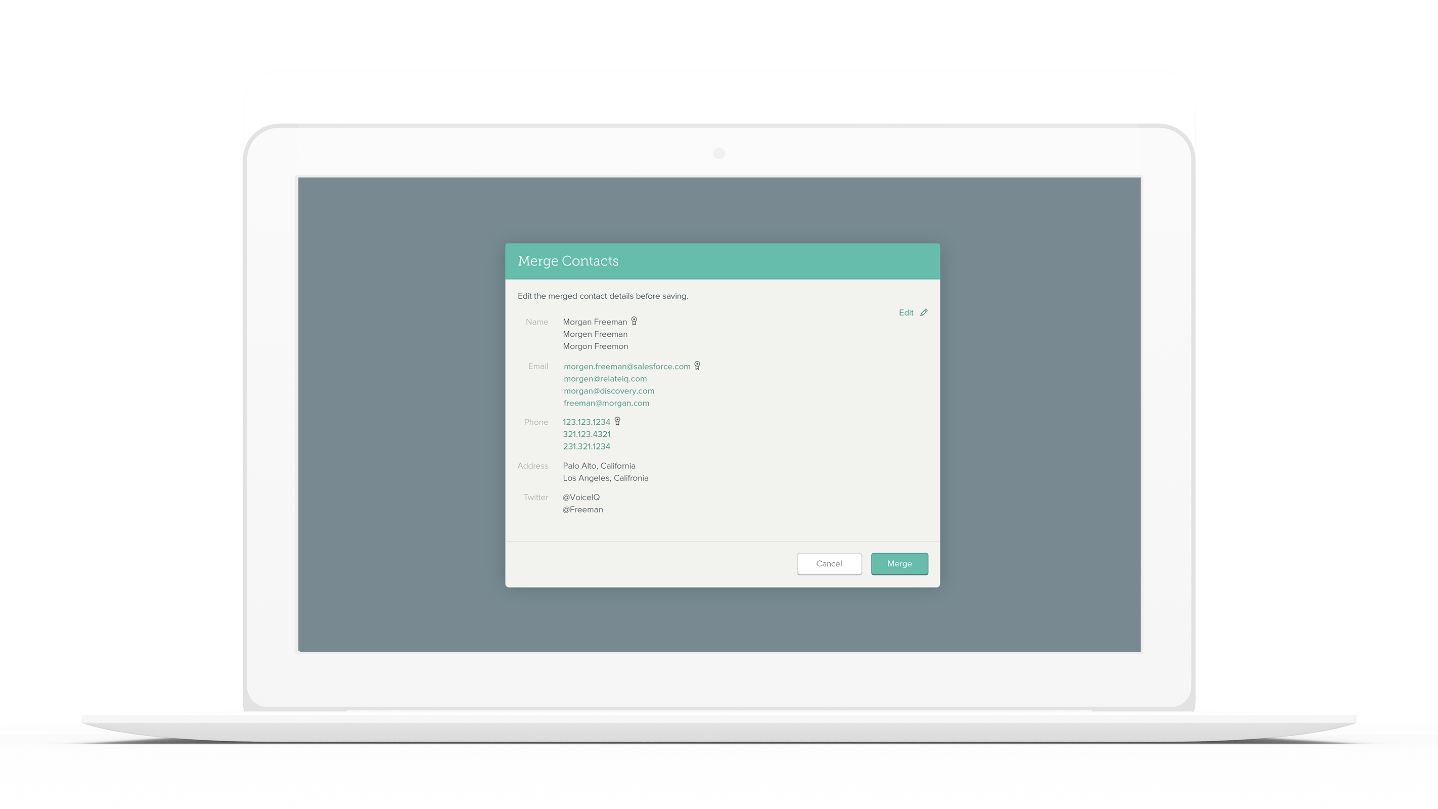
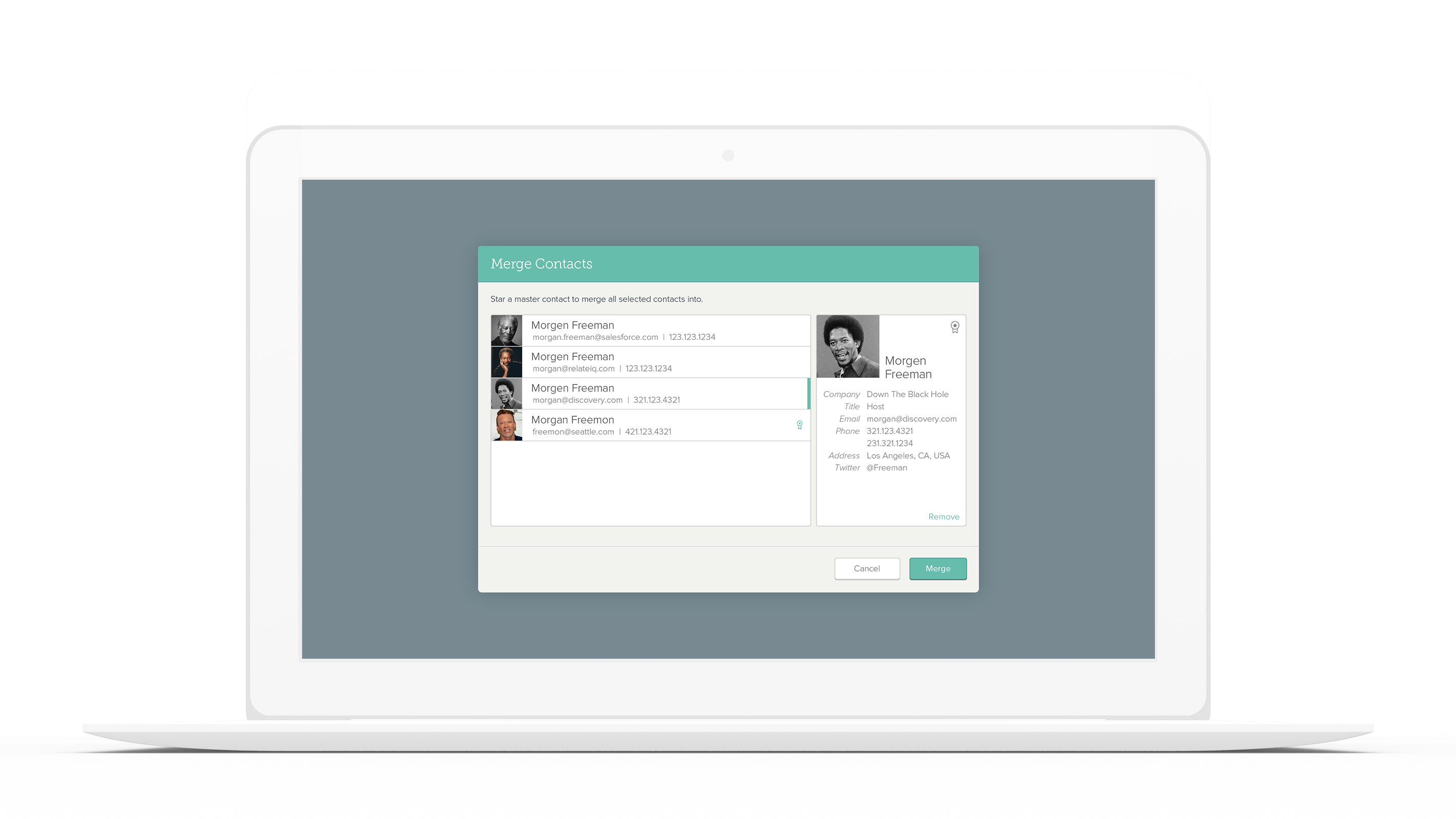
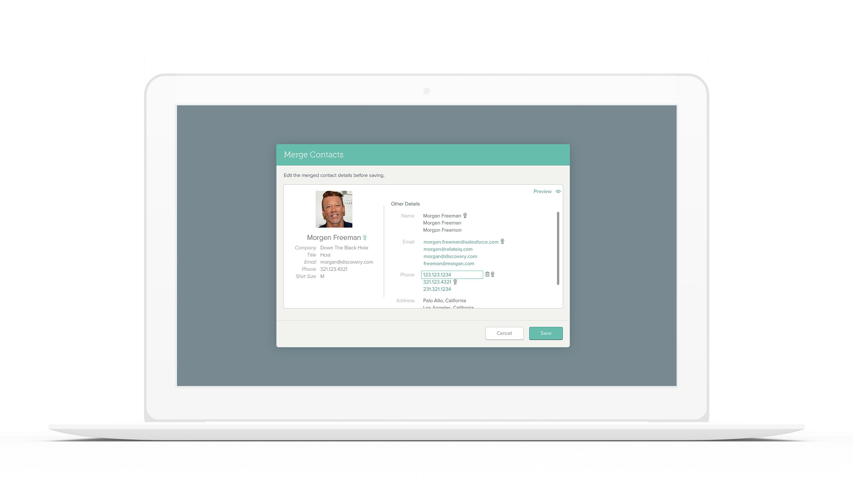
Multi-Merge
Previously, you could only merge two contacts at a time. This was a very cumbersome and time-consuming process. With ADC, you could potentially have dozens of duplicates with variants in what they contained.
High Fidelity
As we got that directional correctness we started to really flush out the flow of each feature. One of the downsides of having Automatic Data Capture is that we ingest duplicates, and when we aren’t able to automatically merge due to a lack of confidence, our users are riddled with duplicate contacts. Before this project, users had to merge 2 contacts at a time which was taxing for users.
Explorations
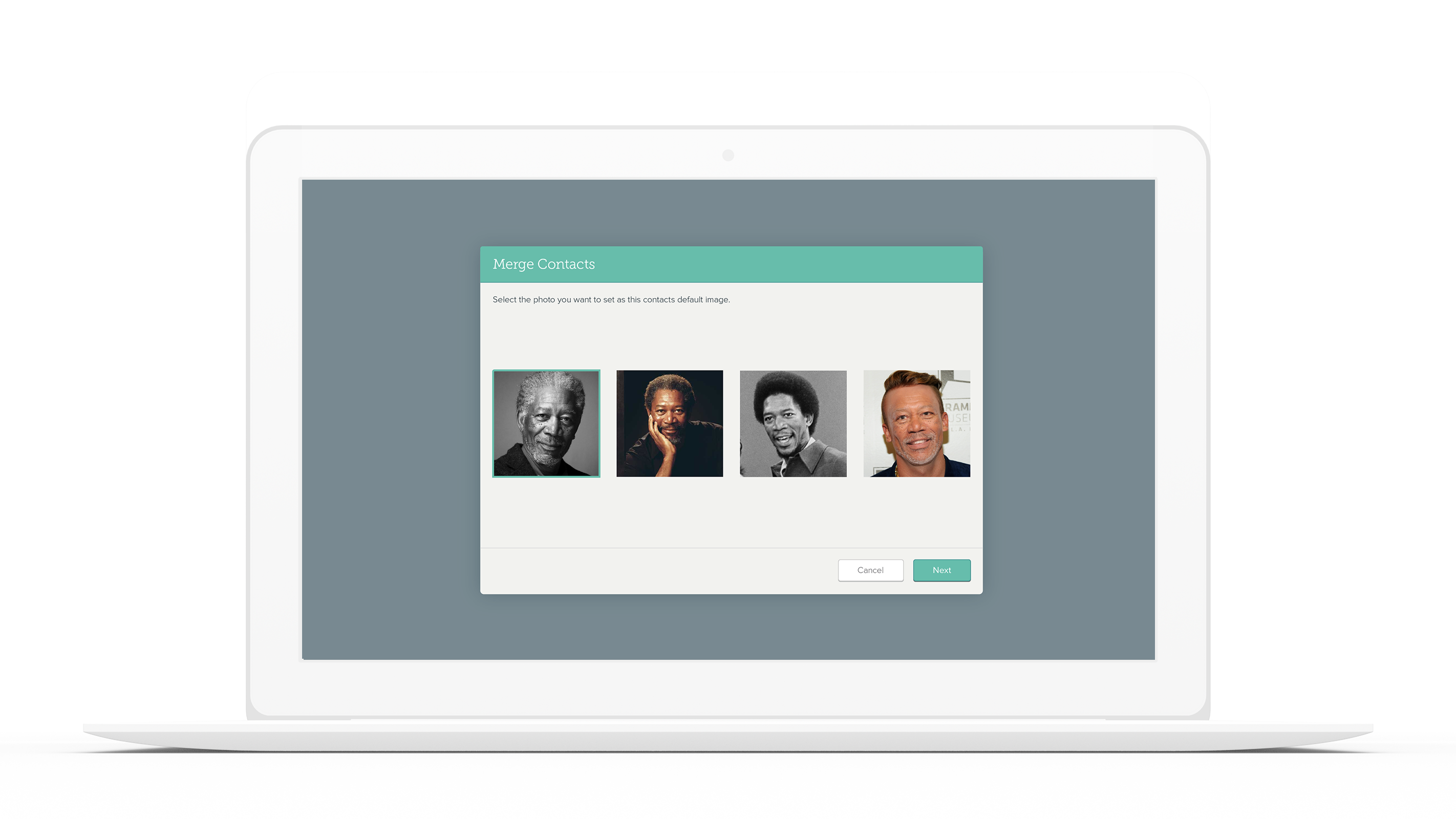
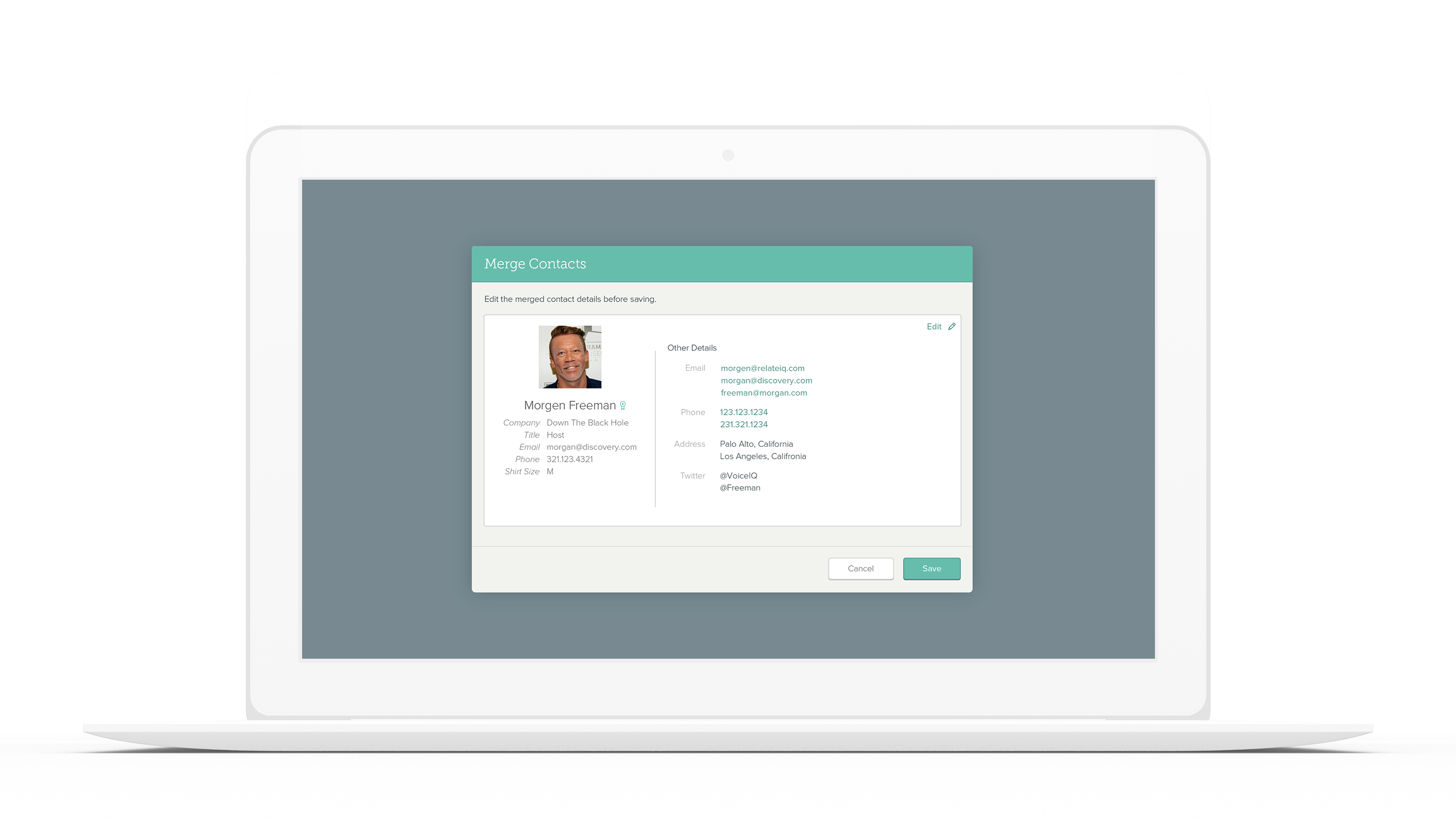
The three final explorations were optimized for different user objectives. The first flow was a visual-heavy flow that catered more towards passive merges. It was optimized for quickness. The second flow was data-heavy and was meant more for users who really wanted to select the right information. It was also intended to help and making sure users had the best data at the end of the process.
Design Recommendation
This flow was the recommended direction I made to the team for a few different reasons. I introduced the concept of a Master Contact to help expedite the merge process. The master contact's information was automatically selected as the primary details, and all non-similar data was preserved as secondary information.
RESULTS
User Love = Success
About six months later we delivered most of the features I wanted, but all of the features we spec’ed. We were more than pleased with the results and our customers were more than pleased with our efforts. We measured success through a few different methods. The first was DAU for each feature, which we saw increases for, 40% for the gallery, and 34% for merging. We had followed up interviews with our customers and internal stakeholders, all of them were satisfied with our solution.
Contact Gallery
+40%
Daily Active Users
Contact Merging
+34%
Duplicates Merged
Selected Works

Essentials NEXTProduct Vision
Salesforce BasecampProduct Vision
Salesforce UXLeadership

Contact ManagmentProduct Design

Sitetracker RebrandLeadership
IAB Interactive TV ProposalProduct Design

Samsung AdsLeadership

SalesforceIQ - Contact GalleryCase Study

AMSA BrandingBranding

Samsung AdsDeep Dive

