
TL;DR
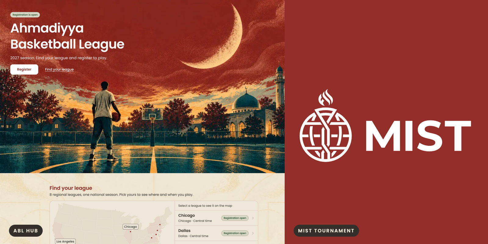
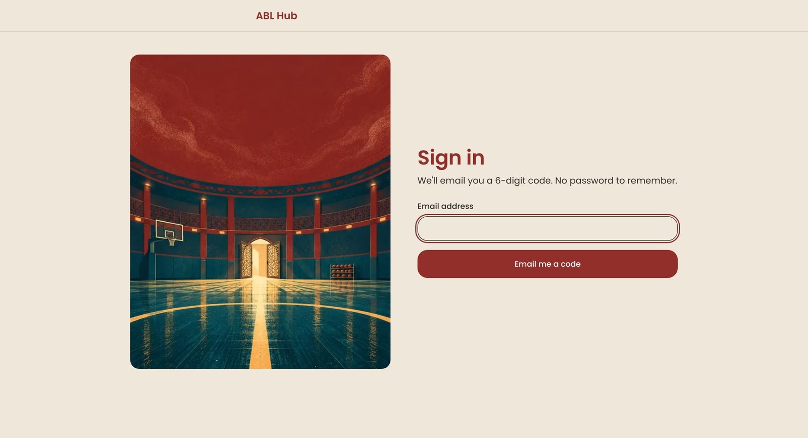
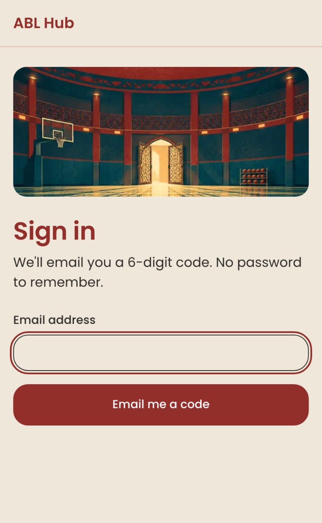
I did not give ABL Hub a new identity. I gave it the tournament's. The 2027 Ahmadiyya Basketball League runs across eight leagues, from NY Metro to Los Angeles, and ABL Hub is its registration and draft platform. As VP of Design & Innovation for MKA USA, I own the system and the product, AI executors build from my specs, and MKA stakeholders hold the calls on legal text, fees and brand approval. My part of this story is the brand. ABL takes the palette and type of MIST, the tournament it feeds, minus the crest, and an illustration language I commissioned carries the rest. The full look, with illustrations, is built on a development branch and not yet shipped. The wordmark and the tournament owner's sign-off are still open, and I say where below.
A league was becoming national, and its look was local
The first brief for the platform carried a dark sports aesthetic and a separate identity for each league. That fits eight local scenes. It does not fit one national league with a draft run by one office, a shared pool of team names, and a season that ends in a tournament.
The tournament already had a look. MIST, the Masroor International Sports Tournament, has a palette and a typeface in the MKA Brand Center, and ABL's season feeds it: the rules set five regular-season games as the bar for playoff and MIST eligibility. A player who registers for the season and later plays toward the tournament should feel the same organization in both places.
What I did
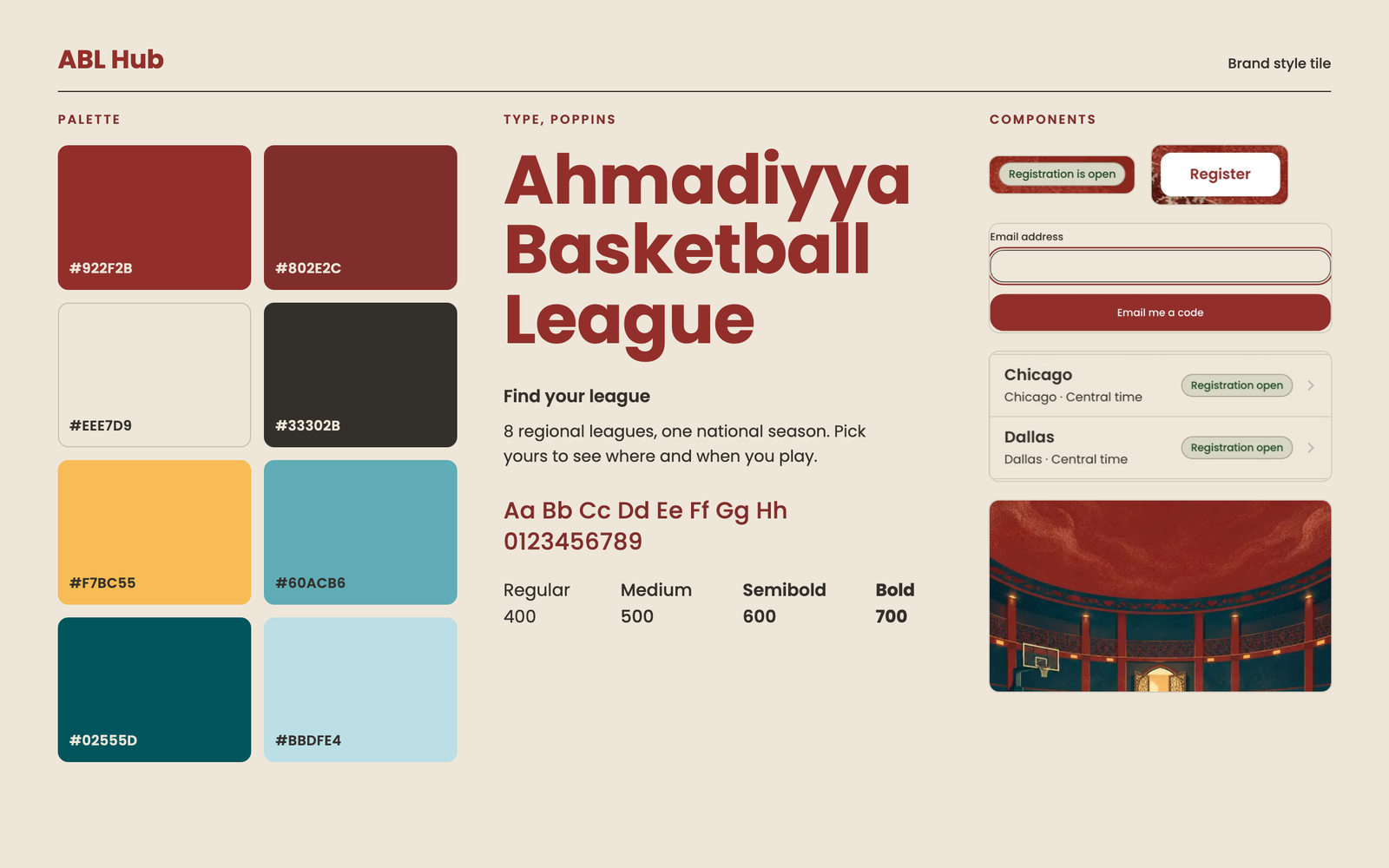
Chose to inherit instead of invent. I decided ABL Hub would use the MIST palette and type from the Brand Center, without the MIST crest. The reasoning I wrote down: ABL is a league feeding MIST, not MIST itself, so it gets the family look and not the tournament's mark. That meant dropping the dark theme and the per-league accent colors. Leagues are told apart by name and content, not by color, because I wanted a league to be a setting inside one national shell and not eight small sites. The cost is real: the MIST profile is light only, so ABL Hub has no dark mode.
The wordmark is still a text placeholder in the tournament's typeface, set as "ABL Hub", until the Brand Center approves a lockup. The brand values reach the product through a generated file, never by hand, so the product cannot drift from the Brand Center quietly. The working rules for every executor are short: semantic tokens only, no raw hex in components, no black backgrounds, no hype, no neon, no counting-up numbers, no jersey-number or slab wordmarks. New components run through the Brand Center's lint, and user-facing copy through its copy check, before review.
Wrote a design standard before drawing screens. I had executors survey 47 app examples and 19 site examples and distill them into ten rules. The idea that held everything together: ABL feels alive because its content changes, such as status, results, rosters and dates, and not because things move. Type scale, clear state and small, well-timed transitions carry the energy. That matched what the tournament's brand asks for: no hype and no counting-up numbers.
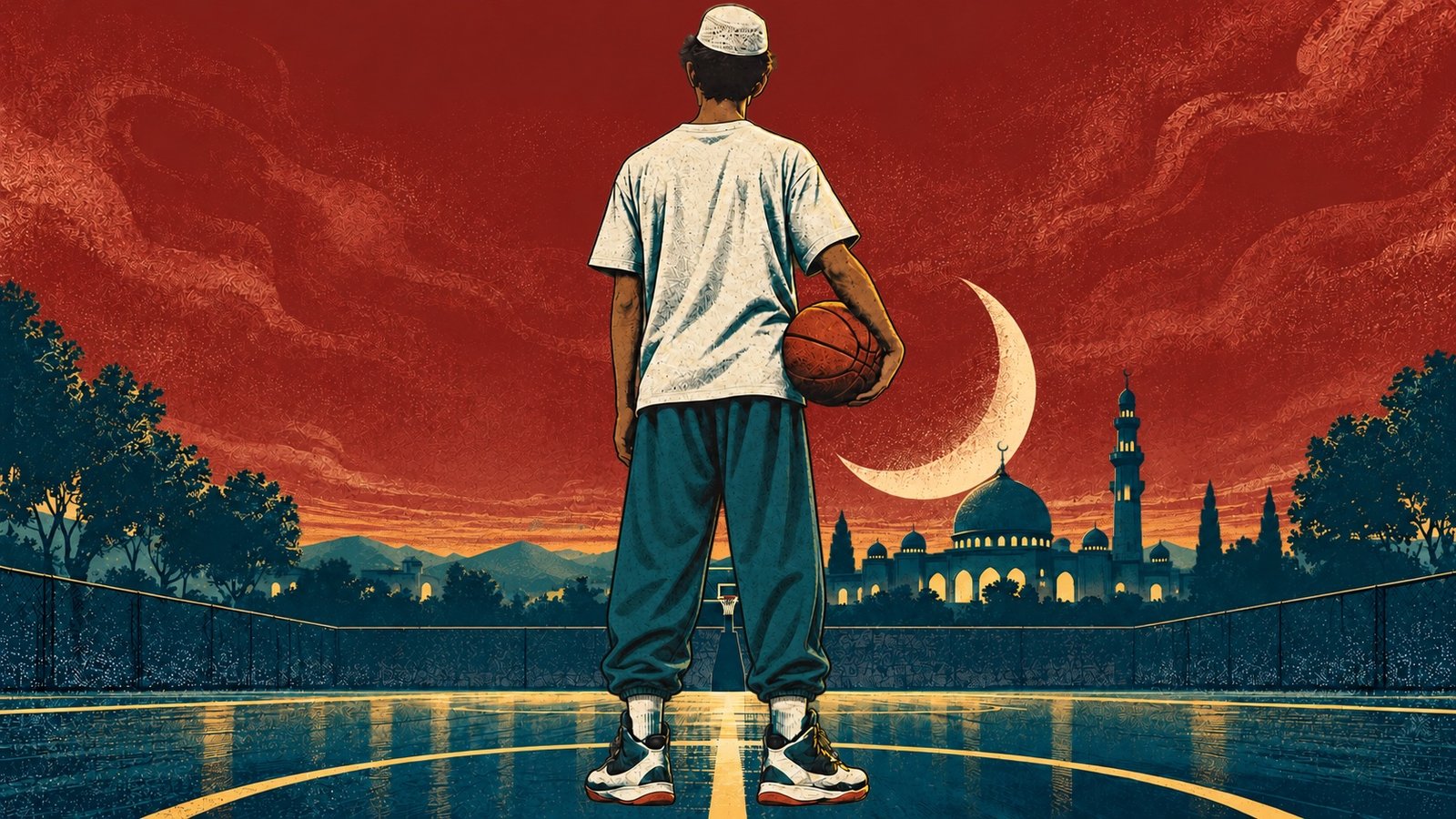
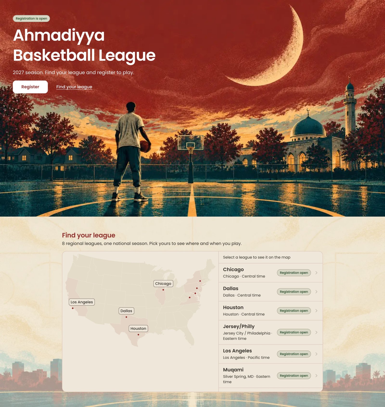
Built an illustration language, then threw away how I first built it. The first set came out as stark flat-vector scenes: bold silhouettes, heavy stippled grain, swirling graphic smoke, the MIST palette only, ink for silhouettes, gold for light sparingly. I loved it and wrote it down as the reference. The next round added the rules a community needs. We depict the league's own players. Settings are where ABL plays: mosque gyms, the annual national gathering's field of white marquee tents, ordinary neighborhood courts, and stadiums only for the two moments that should feel electric, the draft board and the team reveal. Islamic influence stays architectural and quiet, in domes, arches, faint eight-point-star geometry and a crescent moon. Never script or calligraphy, and never prayer.
My feedback after the second round was about place and people. The second round had put palm trees and a walled-town skyline into several scenes. The settings had to read as America first: suburban towns, maples and oaks, American mosques with a modest dome and one minaret. The groups had to be visibly diverse, weighted toward Pakistani.
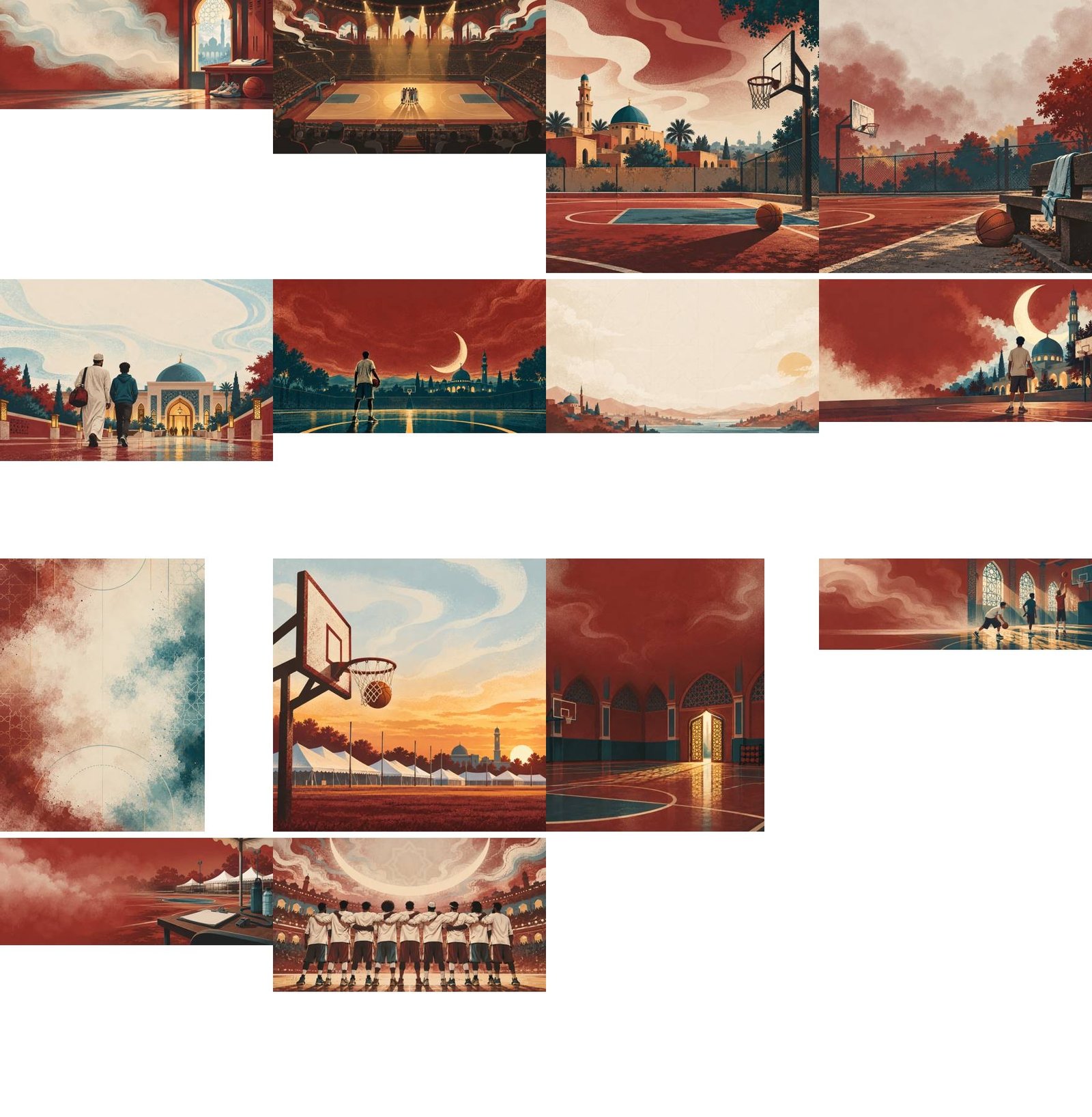
The fourth round fixed a process mistake of mine. The earlier rounds generated background, scenery and people as separate images and stacked them. Each had its own horizon and scale, so doors floated, basketballs floated, and giant people stood in a stadium. The fix was to paint one coherent scene at a time and derive the layers from it afterward, by editing the people out and differencing the two images. It cost a full round to see that I had specified the pipeline wrong.

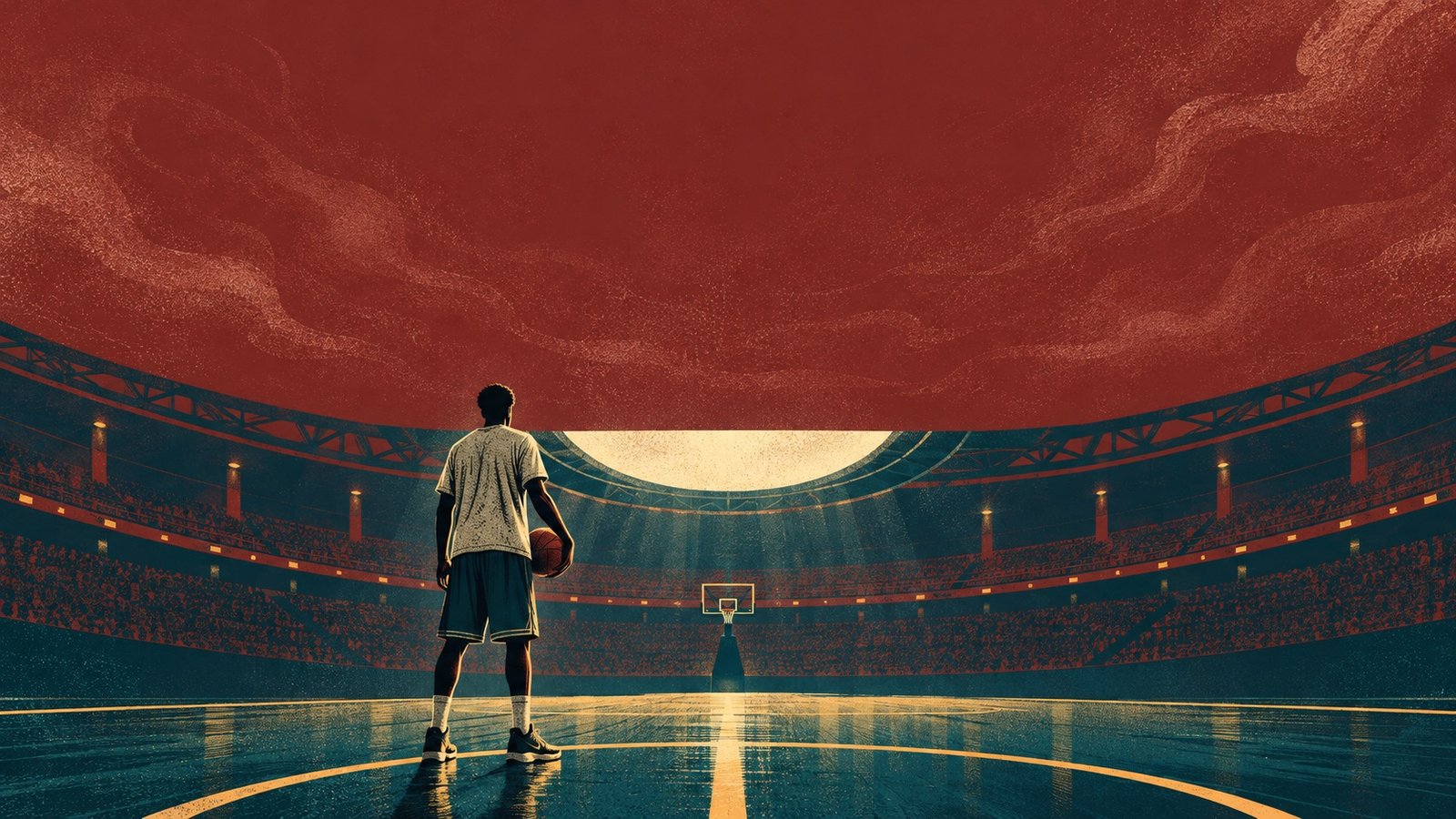
Made the hype moments small. The brand says no hype. The brief wanted the draft board and team reveal to feel electric. I held both by scale: the stadium is large, the players are small in it, and the light does the work. A community, not a spectacle.
From league to tournament
The carry-through is designed in but not yet lived. Playoffs and MIST sit outside the first releases, so a player today meets the brand in registration and the draft. What I did build for it is the discipline: ABL takes the tournament's tokens by generated file, keeps its own wordmark separate, and leaves the crest with the tournament. On the development branch the crest appears in exactly one place, as the foil pattern on the player card that builds as a player registers. League identity comes back in one small place too: coded stamps on that card, Virginia's a cherry blossom. Everywhere else the leagues are told apart by name. When the season feeds the tournament, the two should read as family, not as one logo stretched.
Where it stands
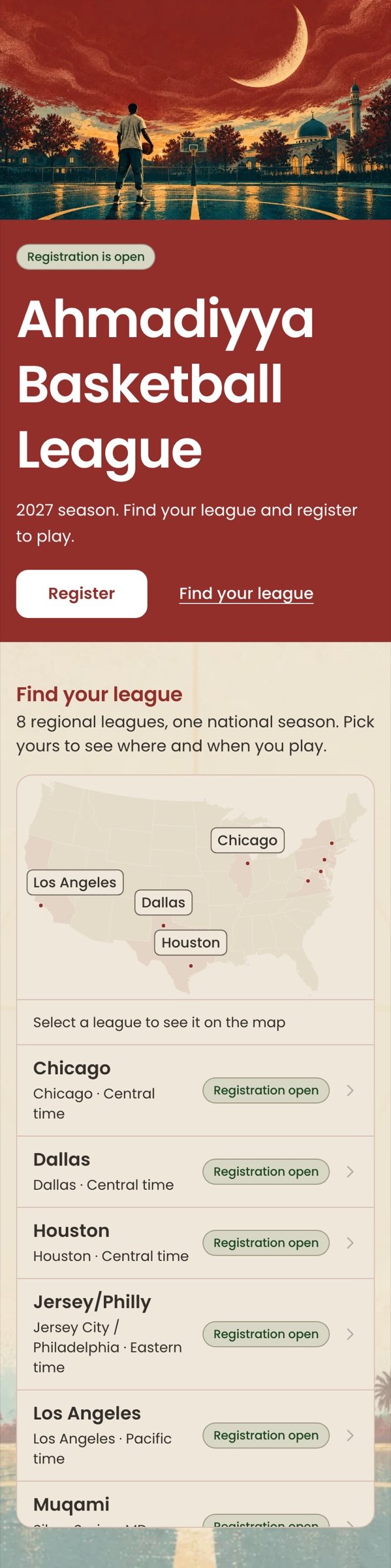
The preview on MKA's own infrastructure tracks main and carries the MIST tokens and the text wordmark. The illustrated landing page, sign-in, player card and league map are built on a development branch and have not shipped. Four brand questions remain open and are logged with an owner: the wordmark has to go through the Brand Center, the tournament's brand owner has not signed off on ABL using the palette, the Brand Center's font data conflicts with its own product system, and the error and warning colors are interim because the brand defines none.
Reflection
Inherit first, and write down what you are not taking. Leaving the crest behind was the cheapest and most useful brand decision. It let ABL look like family without claiming to be the tournament, and it gave the brand owner a clear thing to approve.
A liked style is not a working pipeline. I fell for the first illustration look and under-specified how the pieces would be made, so one round produced scenes that looked pasted together. The look was right. My instructions for building it were wrong, and it showed in the first stadium.
I shipped on a palette its owner has not blessed. The tournament's brand owner has not signed off, the wordmark is a placeholder, and the error colors are interim. I would rather have the open items logged and visible than waiting for approval to start, but if sign-off came back with changes, I would be re-theming a live product. The generated token file keeps that to one file, which is the reason I built it that way.