
I love Yelp. I don’t think I could live without it. Whether I am back home visiting my parents, at my apartment, or visiting a completely new city; Yelp helps me make good decisions. I usually plan my day around Yelp, scoping out possible venues before leaving.
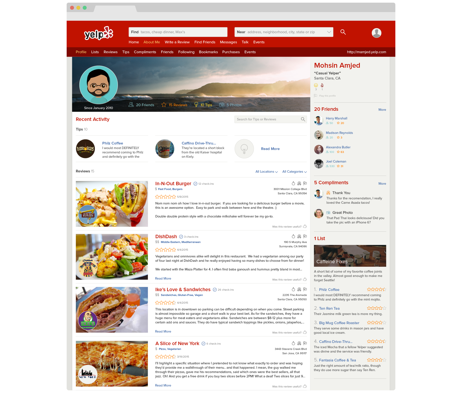
I wanted to take a stab and making the user profile easier to decipher in its web form without losing the Yelp brand. The redesign is uniquely Yelp. The new look is modern and flat. It is simple yet doesn’t rely on trends to make it relevant. It is light and legible with none of the bloat.

Less Edges, More Space
The current design is boxy and confined leading to an almost claustrophobic feel. I focused rounding out hard edges, both visually and mentally. Users perceive circles as more spacious as opposed to squares. Using circles for key images helped open up the design.
Clean Lines
The 960 grid helped bring the web into a new age of clean lines. Today it fails to fulfil the needs of a device agnostic web. Moving away from the 960 grid to a custom 12 column grid gives a full bleed feel. As a result the page’s content shines through as the true hero.
Downstream Flow
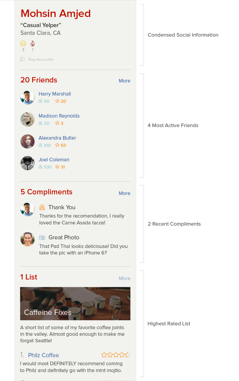
The sidebar structures social details in a logical flow. Information cascades down the side from most personal to communal data. Eliminating gimmicky stats and preserving usefulness helps keeps the page actionable. Name, location, and status serve as a base. Ranking friends by activity increases perceived network health. Compliments serve to add profile value, and list surface user contribution.
Bite Size Content
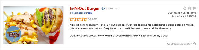
Yelp is all about reviews, but the user profile page wasn’t. The new design give reviews a considerable part of the page, yet keeps them short. Progressive disclosure allows browsing user to get just what they want. Incorporating business images add visual diversity while creative interest. The result is a review that is easier to parse, yet more inviting.

Personalized Uniformity
Cover images are common in modern platforms. They are simple yet bring in intense customization. Cover images allow users to express themselves within constraints. Surfacing user stats, profile image, and tenure further this personalization.
Conclusions
The current design seem claustrophobic, old, and stale. Taking modern cues, the user profile page can help update the Yelp brand. Switching fonts from Helvetica to Proxima Nova helps create a friendly feel. Discarding intangible information can help focus the page. Employing simple techniques can lead to better information architecture and a more engaging content.