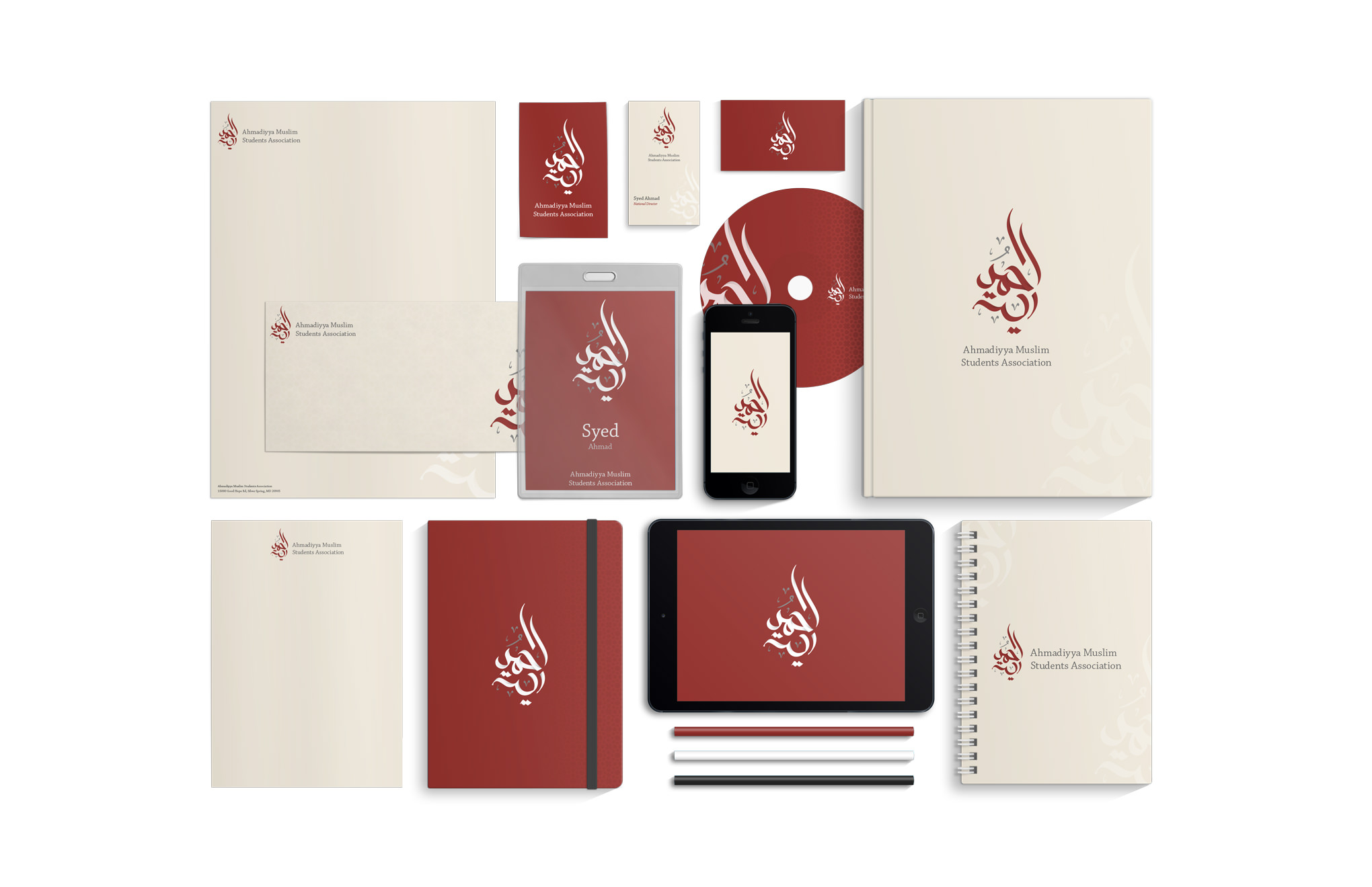
The Ahmadiyya Muslim Youth Association USA decided to rebrand all of its sub organizations after the success of the internal rebrand I completed in late 2013. I was tasked with rebranding and overseeing the implementation and adherence of a new brand for each organization. I hired two designers who specialized in logo design, one a logo designer, and the other an Arabic Calligrapher to create designs to present to the executive board for selection.
After a few weeks of collaboration, I decided to proceed with the Arabic calligraphy. After receiving the logo files, I explored options for the logotype, picking Chaparral Pro for its elegance and variety of weights available. When deciding the color palette for the Ahmadiyya Muslim Students Association, I decided to inherit the color palette I had chosen for the parent organization, as they both have very similar missions and principles.


Event Verticals
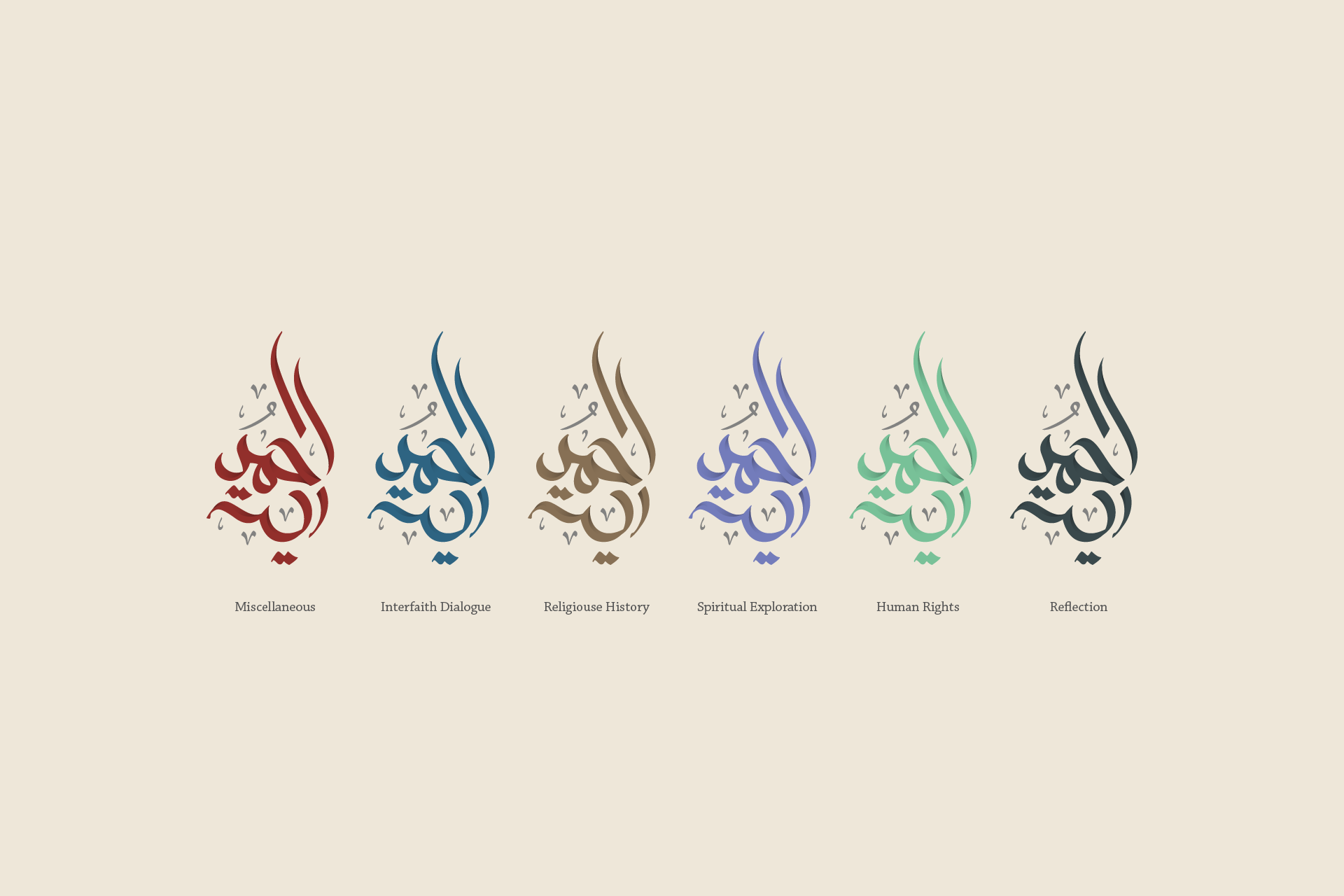
I chose the color palette based off of organization keywords and correlated those keywords with emotions associated to the psychology of colors. Our final color palette consisted of Red for courage, Blue for loyalty, Brown for strength, Purple for wisdom, Mint for health, and Slate for prestige.
Based off of these color & emotion combinations, I created logo variations centered around the types of events AMSA holds. These events boiled down to the following verticals: Interfaith Dialogue, Religious History, Spiritual Exploration, Human Rights, and Reflection.

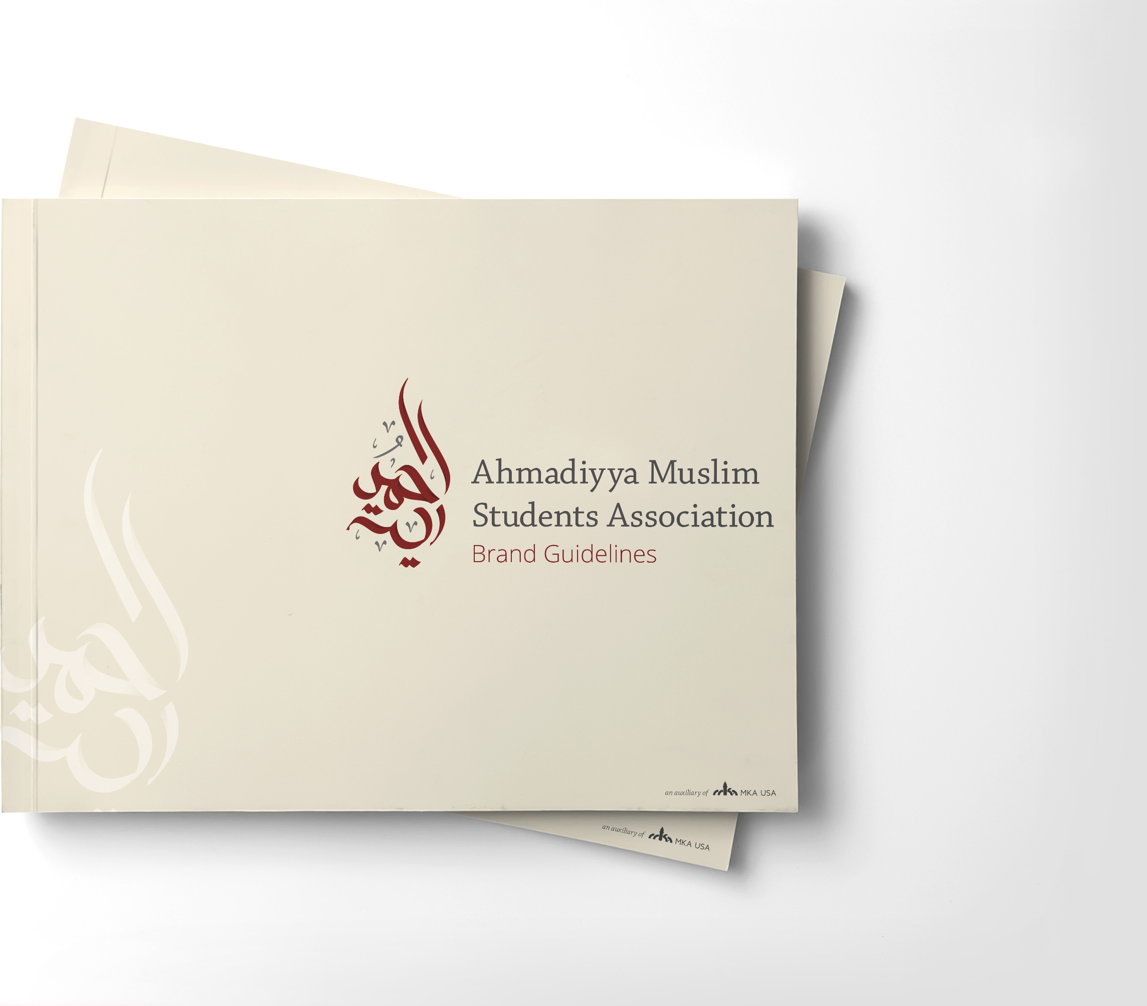
Brand Guidelines
These brand guidelines were to be used by average students at various universities across the country. It had to be simple enough for an artistically challenged individual to understand, yet structured enough that they didn’t have to rely on their own creativity to produce quality materials.

